Landing page features and benefits intro
There is a number of landing page features and benefits that will be discussed in this article. You most certainly have come across some of these things when you visited a business website. Any experienced company recognizes the value that these features have in their marketability. Understanding what they are and how they help your website achieve its goals is significant. You will learn that with each landing page’s feature there is something instrumental that you can receive from it.
What is a landing page?
To understand landing page features and its benefits you must know what a landing page actually is. It is simply a web page in which you get the visitor of your website to perform a particular action. Moreover, it is a point of contact between you and them. Whenever an individual lands on your website you need to collect personal information from them in exchange for a product. Whether you’re offering an ebook or a monthly newsletter a landing page is where you want them to convert. Not all landing pages offer the same thing, but have common elements. Now let’s dive into landing page features and benefits.
Feature: Headline communicating the product
One element of a landing page is that it conveys what you are offering through its headline. For example, when Netflix wants people to subscribe to their video streaming platform they’ll use a headline. In the example below you’ll notice that at the center of the page there is a headline from Netflix offering people their services. The visitor of this page recognizes right away what they are signing up for.

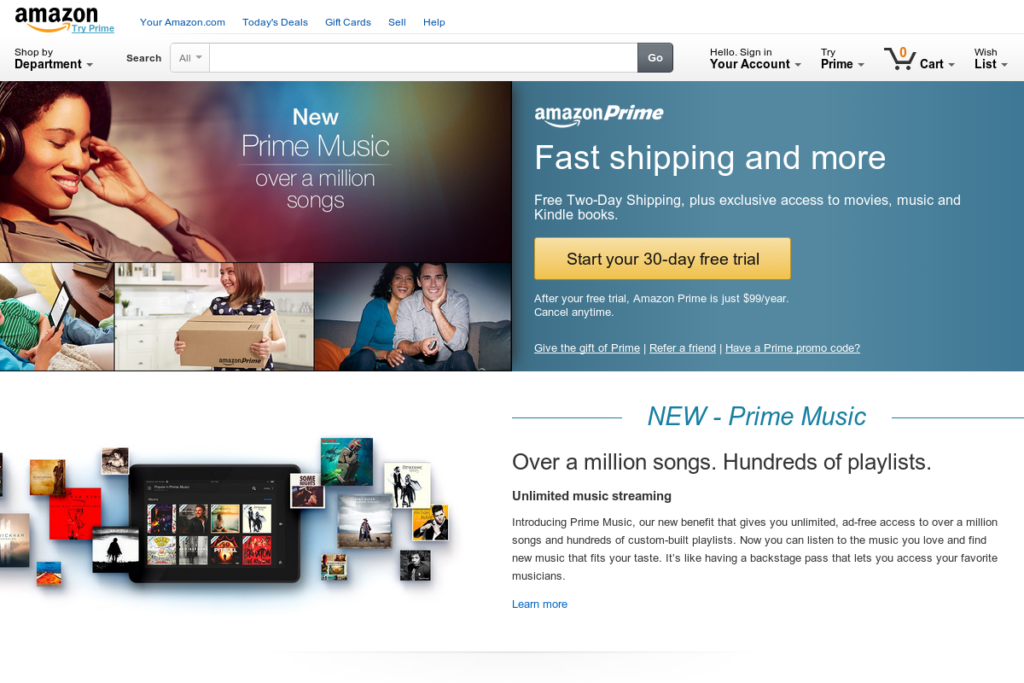
Another example, of an effective headline is from Amazon Prime. Even though a person might not have ever heard of this company they are informed that it offers customers over a million songs. The headline is strategically placed at the right top of the page and is one of the first things that draw attention.

Benefits of a headline:
There are several reasons why using a headline is beneficial. Firstly, it speaks directly to the people who visit your page. Communicating what you are selling to your customers is a part of marketing 101. Secondly, you are displaying to visitors what they will receive from your business. Without this information they will not feel any initiative to carry out the next step. Lastly, a headline narrows down your prospects. By featuring a headline you’re specifically targeting those who are looking to benefit from your product while weeding out everyone who isn’t. After all, it is those who show interest that are the most vital to the growth of your business.
Feature: Good design for landing page
Another feature of having a successful landing page is a good design. You do not have to be a graphic designer, but your design has to be relevant to your product. Using stand out images or basic background colors could go a mile. Having the logo of your business visible is a must. You want to avoid too many images on your page or using more than a couple background colors. You do not want to put off visitors by having too much on the page.
Petco does a very excellent job in their landing page design. With two background colors you can easily view their headline as well as what they offer their customers. They use a basic image to capture your attention and inform you on what they sell. The headings on the page are straight to the point and make you aware of what they promise. They also showcase their company’s logo without it taking away from everything else on the page.

Benefits of good design for landing page:
There is more than one benefit from your landing page being well designed. One, it provides an overall excellent experience to visitors. The last thing that you want is for someone to feel negative after visiting your page. Second, good design makes a great first impression on your company. There will be a percentage of people that’ll first encounter your business through its landing page. For those visitors it is your only opportunity to showcase your services to them. Last, having a well put design increases the chances that users will take action. If you are serious about how your page looks it shows customers that your business should be taken at face value.
Feature: A call to action on landing page
A landing page would not serve any purpose whatsoever if it did not call people to action. Before creating your page you should ask yourself what you want visitors on your site to do. What purpose do you want to achieve through this page. Do you want people to make a purchase of a product or service you’re selling? Do you want them to register for an event that you are hosting? Is your goal for people to sign up to an email list? Another question you should ask is how you will get this done. Will your page direct them to a contact form? Will you lead them through a sale’s funnel?
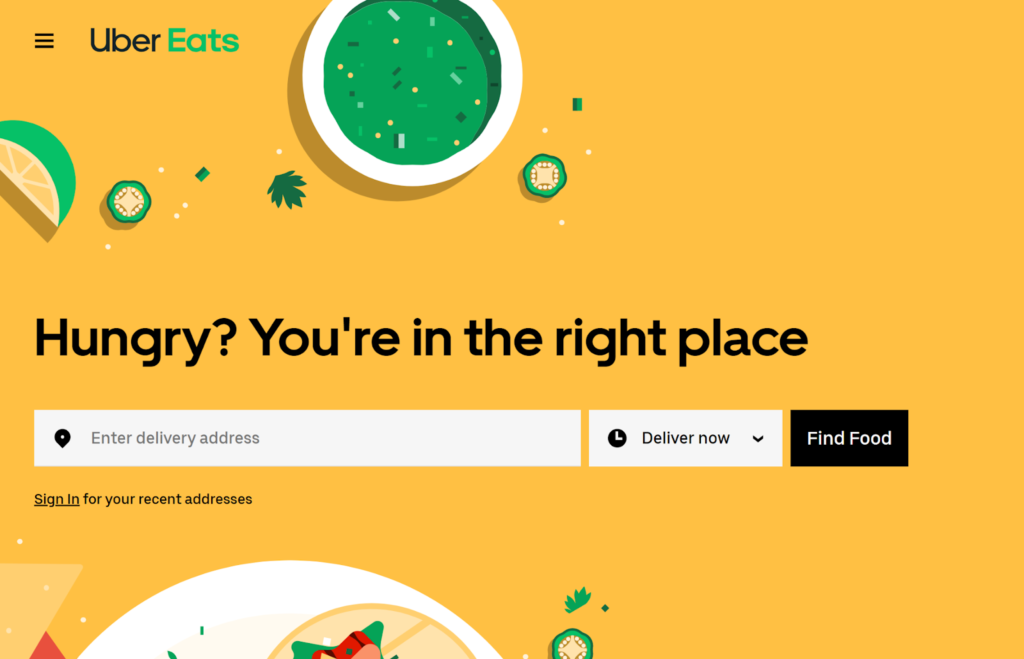
Take a look at this Uber Eats landing page and how it calls potential customers to action. Their goal is to get you to order food from their page and have it delivered to the location of your choice. Their headline is clear and they provide you the option to enter an address and schedule a delivery time.

Another excellent example of a call to action on a landing page is from this Growth Acceleration Summit. From viewing this page it appears to be some type of annual event in which people register for. Right at the center of the page is a Register Now button that guests can click on. Not only is there a registration button there is a call to sign up for event updates.

Benefits of a call to action on landing page:
The advantages of an action call to your landing page are apparent. With this feature you go from visitors just viewing your page to converting them into customers. You also achieve the goal of growing your brand. Instead of your page being obsolete it will serve as a channel to increase the amount of regular clients. Not only will your brand expand it will also help you gain credibility in the niche that you are in.
Feature: Client feedback
The feedback that you receive from your clients is a significant mark of a landing page. Client feedback includes testimonials, reviews, badges and star ratings. Many landing pages have this element to build trust with people. Not many people will be willing to try out a product unless they know that it meets the necessities of others. After all, we live in an age in which something isn’t deemed credible unless someone gives it a like or thumbs up. Your business needs to stand out through the voices of others.
In the page for this restaurant named Munchery you will notice the star ratings along with customer testimonials. At the bottom of the page there is a heading indicating what customers think about this business. The green star icons, the headings, testimonials and names of the persons writing these reviews are all visible. Not only does this page have its own reviews, but it includes those from the website Trustpilot.

Benefits of client feedback
Displaying the feedback that you receive from clients is essential in a number of ways. You build authenticity with customers. People will most likely do business with you because of it. You also obtain an advantage over your competitors. Potential clients most likely will choose you over a business that does not have reviews. Not only do reviews let others know how great your business is it provides you with knowledge of what you need to improve on.
Feature: Mobile friendliness
You cannot have a landing page if it is not compatible with mobile devices. The design of your page needs to be suitable for mobile screens. Your page also has to be easy for mobile users to navigate through. If it is too slow or it has too much going on you will lose a lot of visitors. The reason why your page must be mobile friendly is because you’ll most likely get a large amount of traffic from people using these devices.
An example of a landing page that is mobile friendly is this one from Country Chic Paint. The image, texts and call to action button are all proportionately sized on the screen. There aren’t too many images or headings crowding up this page. Customers can easily purchase what this company is trying to sell them without having to do much scrolling.

Benefits of Mobile friendliness
Your page being compatible with mobile devices goes a long way for a few reasons. Being mobile friendly increases your page’s SEO. Google’s algorithm favors pages that can load fast and appear tidy on all types of screens. Your conversion rate also increases with a large percentage of people using smart phones to purchase products. You want to be able to provide the best user experience possible to those people who do not regularly access the internet on a desktop.
Conclusion of landing page and benefits
Now that you have learned about what a landing page is and how its features can be beneficial you can take the next step. Whether you want to create a new page or improve on the one you have is up to you. My advice is for you to continue viewing different landing pages across the internet to come up with ideas to implement. You can also use landing page templates that are available for free. By including what was discussed In this article regarding landing page features and benefits I guarantee that your page will achieve its purpose.
