Before understanding color psychology in website design we need to define what color psychology is. It is simply how colors affect human behavior and emotions. The way that a person perceives certain colors influences their actions and feelings. As creatures we attach a color to a particular object, emotion or concept. For example, people usually associate the color red with love, anger, warning or blood. Some correlate the color grey with neutrality, intellectualism or depression. Warm colors like orange and yellow are categorized as vibrant and exuberant. Cool colors such as green, blue and purple are labeled as soothing and relaxing. Businesses and marketers use color psychology to sell products and build a customer base. The colors that you use on your website will determine what type of response you will get from users; that’s why it is important that you use the right color scheme.
Despite the complexity of web design, you do not need expert knowledge in graphic design or to hold an art degree to recognize how colors work. A general overview of color theory leads to the ability to effectively use colors. If you learn the different type of colors used in web design it can save you a lot of time. You won’t have to spend extra hours guessing which colors mix with one another. Of course the more experience you get at using colors the easier web design becomes. Below you will see basic terms and their definition regarding color psychology in website design.
Color psychology in website design vocabulary
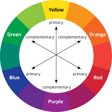
Color wheel– A circular diagram consisting of 12 different color hues displaying the relationship between primary, secondary, and tertiary colors.
Hue– The origin of colors that are visible to us.
Shade– A color or combination of colors in which black is added.
Tint– Any color or combination of colors in which white is added.
Tone-Any color or combination of colors in which pure gray is added.
Primary colors– The three colors from which all other colors can be created.
Example: Red, blue and yellow.
Secondary colors– A color that is derived from the combination of two primary colors.
Example: Purple (red and blue), Green (yellow and blue)
Tertiary colors- The combinations of primary and secondary colors.
Example: Red Orange, Blue Violet, Yellow Green.
Monochrome color scheme– It is comprised of different shades or tints of one color.
MONOCHROME COLORS
Analogous color scheme– It is comprised of different colors that are next to one another on the color wheel.
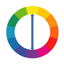
Complimentary color scheme– Makes use of one main color and its complement, which is found on the opposite in the color wheel.
COMPLIMENTARY COLORS
Split–complementary color scheme– uses two colors across the color wheel, with those two colors lying on either side of the complementary color.
SPLIT-COMPLIMENTARY COLORS
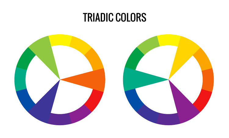
Triadic- Is a color scheme in which there is one dominant color with two other colors evenly spaced.
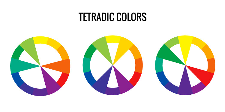
Tetradic- Is a color scheme consisting of two sets of complimentary colors.
Primary Colors
When you view the well known furniture conglomerate IKEA’s website you’ll notice how it consists of the primary colors of blue and yellow. On the upper left hand corner of their page these two colors are used for their company’s logo. There is an excellent color contrast in the background of blue on the left and yellow on the right. Not only do we see yellow as a background color, but it is also used to sell an arm chair. Featuring this color chair along with the yellow background leaves a person with the impression that this is a product manufactured by IKEA.
Secondary Colors
Here is an excellent example of the use of secondary colors by this team building company called Tiny Campfire. The combination of purple and orange give off the camping impression to anyone who has experienced such an activity. Even if you’ve never slept in the wilderness you can definitely associate orange with fire and purple with night time. An interesting thing about this design is how it uses animation in its color scheme.
Tertiary Colors
This company named Judy, which sells emergency kits, uses the tertiary color red-orange as a background color. Red-orange is a color that is related with caution and warning. For a website that is marketing safety products, the use of red-orange is ingenious. This design also has a color scheme of red-orange, white and black. Both the background and item being displayed share this color pattern. Although red-orange is mostly used, the colors black and white allow people to be aware of the text on the page.
Complementary Color Scheme
Complimentary color schemes can make your design look appealing like how it does on the website of this software business called TrackOlap. Although blue is the color that dominates the design, it is neatly complemented by orange. This design also proves that the use of a color like white can enhance the appearance of two complimentary colors.
Split-complimentary Color Scheme
The split-complimentary color scheme is used on this sports website of the Florida Gators. The dominant color here is red-orange while the two subsequent colors are blue and green. As you look at this design you will notice that this color pattern is used as the team’s colors. If there is one takeaway from this, it is how much color combination is significant in the brand design of sports teams.
Triadic
The well known Lego brand strategically has a triadic color scheme in their web design. This color scheme is made up of the primary colors red, blue and yellow. Yellow as the dominant color is used most to showcase products and call people to action. The color blue appears as a means to draw attention to the video that is on the page. Even though red is not used as much as the other primary colors it is a part of Lego’s trademark.
Tetradic
This food business named Nature’s Table uses a tetradic color scheme in their design. The pattern that is used is green, blue violet, red and yellow-orange. What makes this scheme work is the image of the fruit salad on the center of the page. The colors displayed perfectly gives a person an appetizing feeling when viewing the page. This is a great way of using more than three colors in a web design.
Monochrome
Starbucks’ website uses a monochrome design of multiple shades of green. By going with this color scheme they communicate their brand identity. They also allow the product that they are presenting to stand out. People viewing the images on the page will be influenced to want to buy a mojito drink. Even though green is not the only color on the layout of this page it is the dominant color.
Another example of a website that utilizes a monochrome design in its layout is Weprofit. As you notice, there is a purple color pattern on the page’s text, buttons and animation. Going with a simple design this company makes it clear that they are an online market place for software development.
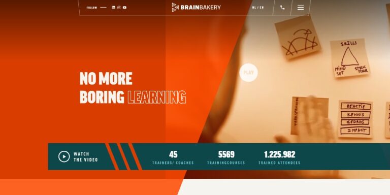
Analogous
Brain Bakery’s websiteuses an analogous color scheme in their layout. By using warm colors such as orange and red-orange as a background they are able to get you to focus on their headline. Although these colors along with green are bright, they are balanced with much lighter colors on the right side. The person who views the page is not overwhelmed by the use of bright colors.
The financial service Stripe uses multiple analogous colors on their website. The cool colors of blue, blue-violet and blue-green on this page give Stripe a professional look. Of these three analogous colors not one is standing out over the others or competing for space on the page. The color green plays a minor role, but also calls people to action.
RGB & Hex
As a web designer you’re not limited to only using the 12 colors as they appear on the color wheel. You can create different colors with the use of RGB (red-green-blue) and hex color systems. These are systems that allow you to combine shades of primary colors on digital devices. RGB uses a three value combination to create one color. For example RGB (59, 89,145) equates to Facebook blue. The Hex model derives from the RGB system and uses a two-digit hexadecimal number. As an example, #3b599b also equals Facebook blue. With both of these color systems you can create countless color combinations for your website.
Conclusion
Before designing a website consider which color combinations are appropriate and how they’re regularly used. If you’re going with a Christmas theme or your website is related to nature then green and red is a good combination. Purple and yellow are frequently used to communicate luxury or creativity. An orange and green combination might not be suitable for medical or banking websites, but for sports and retail sites. Although there isn’t a law on which color combinations to use on a specific design you must do your research. Observe the color patterns from websites in your niche. You can also use color generator tools like Adobe Color CC, Coolors or Khroma. The creative power is in your hands.
If you have any questions regarding color psychology in website design or would like to add anything, please comment below.