Intro- Web accessibility best practices
Web accessibility best practices are vital principles that ensure your website is used by individuals of all abilities. Inclusivity allows you to reach more people, expand your services and earn a good reputation. Creating a website takes preparation and planning. It isn’t enough to design a web page without considering the type of people who will visit it. You must know your audience and the benefits of connecting with them. Almost 60% of the U.S. population with disabilities has access to the internet. That percentage includes those with visual, audible, mobile, neurological and cognitive disabilities. The design and functionality of your website needs to be accessible to this demographic. There are certain features and functions that you can add to your website to make this a possibility.
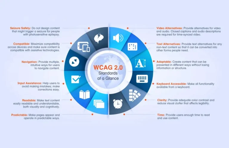
Before we discuss web accessibility best practices we need to learn about the Web Content Accesibility Guidelines (WCAG). These are guidelines that are published by W3’s the Web Accessibility Initiative (WAI) which ensures that websites comply with the Americans with Disabilities Act (ADA). The WCAG utilizes a ratings system to help you meet requirements in your designing process. Unless your website is one owned by the U.S. government, it isn’t legally binding to follow these guidelines. But if you’re selling a product or service you do not want to risk getting sued for your website being in accessible. If you want to learn more about WCAG you can click on the image below.
1.Alt texts

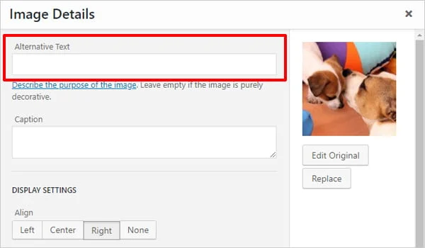
One way to make sure that your website is accessible is to use alt texts in your images. This allows screen readers to access key images for those with visual or cognitive disabilities. If you are using HTML in a code editor you can write the text descrition next to your image text. WordPress makes its easy for users to use alt text inside of the image gallery feature. Not all images on your page need to have alt text. Images that are not relevant to the context of your page can do without it. Make sure that the descriptions are not too wordy or incomprehensible to the person accessing your website.
2. Color customs

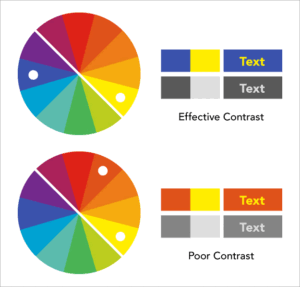
Another method to consider when it comes to your site being accessible is color customs. Ensure that the colors that you use are visible to certain users who are visually impaired. Also use underlining, labels, or other visual indicators in particular areas on your page that require action. Contrasting the background color that you use with the text is important for the visitors of your site. If you want to make it easier for users you can provide them with the option of customize the colors on the page. Not only can you use colors to enhance web accessibility, shapes and patterns are resourceful.
3. Text based features

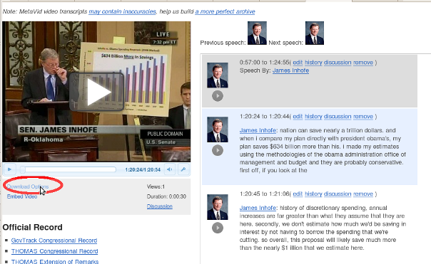
There are several strategies for making your website usable for those who have hearing disabilities. Firstly, you can provide caption in the videos that your site uses. Subtitles are a must if you want people to engage with your multi-media content. Be sure that the videos on your site are visible. Secondly, if your website has podcasts or other audio content, using text transcripts should also be mandatory. Here, you do not want there to be any spelling or grammatical errors. Thirdly, make sure that you use visible features and icons with sound options. This is significant when it comes to volume control.
4. Keyboard navigation

Keyboard navigation is a crucial element to how people access your website. Not everyone can access and browse the web using a touch screen or a mouse. Many people only use a keyboard to navigate through the web. Using a “Skip to Content” link gives users the chance to go straight to the main content on the page. Keyboard shortcuts help a lot with navigation. Providing a visible indicator of the important features on your website’s page is a necessity. This can be accomplished through the indicator highlighting key elements. Not all elements on your page need to be highlighted. Color contrast between the background of the page and the item should be up to date. The order of how your indicator highlights elements during keyboard navigation should also be properly formatted. Most websites use a left to right and top to bottom navigation.
More web accessibility best practices
Testing your site on more than one device cannot be overlooked when it comes to web accessibility. According to statistics, about 70 percent of people with disabilities are smart phone owners. So you have millions of people who need to access your website on mobile devices. The design that you use needs to be able to adapt to the different screen sizes used. The font that you use has to be readable. Be sure that the elements that you use on a desktop computer, such as screen readers, subtitles, and text transcripts all appear on other devices.

Mobile Device
One of the best ways to ensure that your website meets WCAG standards is to have others test it. Before making your website public, ask several people for constructive feedback. Find out whether there is anything regarding web accessibility that needs to be improved. You can also ask them to rate or grade your website’s navigation. Having other people examine your website’s accessibility will save you a lot of time and money. Instead of spending a large percentage of cash on accessibility programs you can receive people’s advice free of charge. This can give you a huge advantage over your competitors who do not take this approach.
Conclusion
Web accessibility best practices are not simply a set of principles to implement, but a way to provide equal opportunity for everyone. Starting your journey of making your website inclusive is not as complicated as you might believe. You can use several different practices to reach people. One, you can search for online courses and tutorials that go more in depth with the topic. Udemy, Thinkific and Youtube are good learning platforms. Second, you could also read articles and blog posts about the subject. The internet is saturated with countless resources. Third, you can learn through webinars. Zoom, GoToWebinar and Adobe are places where webinars are hosted.


